
In today’s digital landscape, mobile internet usage has seen an exponential increase. With more people using smartphones and tablets for internet access, having a mobile-friendly website is no longer optional but a necessity. This brings us to the importance of responsive web design, which ensures your website performs well on various devices, from desktops to mobile phones.
We have already discussed the topic “How to Make Your Website Fit to all Screen Sizes”. And here we are going to discuss the Importance of responsive design. It is possible to build a site that is equally favorable for both desktop and mobile users. The design is called responsive web design.
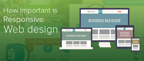
What is Responsive Design?
Responsive design refers to a website framework that adjusts seamlessly to fit the user’s device, providing an optimal experience no matter how they access the site. It incorporates flexible grids, flexible images, and media queries to adapt the layout to the viewing environment.
Why is Responsive Design Critical for Your Business?
- Mobile Usage is Exploding: Statistics from CISCO have shown that mobile data usage is increasing dramatically each year. It’s projected that by 2015, mobile internet users will outnumber desktop users significantly.
- Enhanced User Experience: Responsive design eliminates the need for a different design and development phase for each new gadget on the market. It provides a consistent experience across devices, potentially increasing lead generation, sales, and conversions.
- SEO Benefits: Responsive design is Google’s recommended design pattern. It consolidates your website onto a single URL, which helps Google index your content better and contribute positively to SEO rankings. It also reduces the likelihood of common SEO errors related to mobile experiences.
- Lower Bounce Rates: Responsive design adapts to the screen size and capabilities of the device used to visit the website, which can significantly reduce bounce rates. Websites that are difficult to navigate on mobile devices tend to have higher bounce rates.
- Future Scalability: A responsive website means you can manage one website with a single set of hypertext links; therefore, you spend less time maintaining your site. This allows you to focus on link outreach with a consolidated Search Engine Optimization (SEO) strategy.
- Competitive Advantage: Many companies still do not utilize responsive web design. By adopting this technology early, you can gain a significant edge over your competitors.
Implementing Responsive Design
Implementing responsive design involves understanding your audience’s needs, the critical paths they might follow on your website, and designing elements that function well on different screen sizes. The goal is to ensure that visitors to your website have an excellent user experience, encouraging them to return and share the site with others.
Responsive design is not just a trend but a fundamental shift in how we build websites for the decade to come. It supports the growth of your online presence and aligns closely with the progression of mobile technology. By investing in a responsive design, you’re ensuring that your business remains competitive, agile, and accessible to all users, regardless of their device.
In conclusion, as mobile usage continues to rise, responsive design is not just important—it’s essential. It’s a key component of any successful digital strategy, helping businesses stay flexible and relevant in a rapidly evolving online marketplace.