
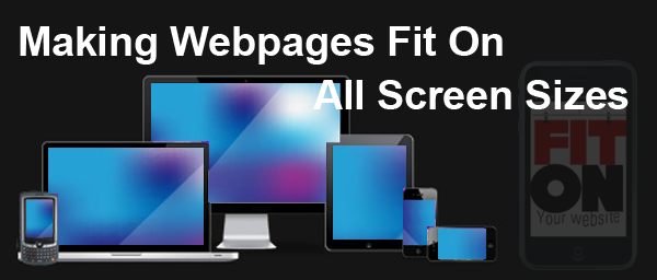
Your face to the Audience
The website is the face of a company, that communicate on your quality and services to the visitors. People used to view your website not only from the computer, as the Internet is made available everywhere with sophisticated devices. We now use various types of internet devices like 3G and 4G enabled tablets, dongle equipped laptops and M2M mobile smartphones. Each of these devices has different kinds of small screen sizes too. Some also prefer to view internet via big screens as there are inexpensive LCD and LED monitors available in the market now. Cisco report says that Mobile data traffic exceeds 10 Exabyte in 2017 and the number of phones will be more than the number of humans in 2013. This report shows how important it is to consider the design in the smaller devices too.
The Resolution Factor
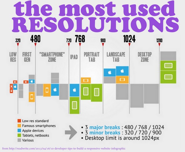
You cannot say that the visitor uses the same resolution that of your system. The web page that fits well in the standard lowest resolution which is 544 pixels wide fits at other resolutions too. 10 years back from now 1024 × 768 was the most common display resolution. Many websites were redesigned to this format from 800 × 600 formats. But CAD users, graphic artists and video game players use their computers at 1600 × 1200 resolution. This resolution is termed as UXGA. We know the computer has higher resolutions than televisions; check the most used resolutions below.
What Web Designer Need to Check
The web designer needs to make sure that all the screen shows his website in the correct alignments. After creating the website, he must check the look and feel of the website on al the screens. So it is important to keep in mind that the website looks differently on different computers and devices, while he designs the website. Once you finish your website and is hosted, if the web page do not fit into the screen of the device display, the browser adds a horizontal scrolling. Similarly the vertical scrolling also comes if it won’t fit the vertical length. It is very difficult to make the whole website under the vertical length, but you can surely design the horizontal length.
Tips on Graphics and Tables
Graphics and Tables have fixed width.
Control the width such that the combined length comes less than 750 pixels.
Avoid specifying the minimum width.
Let the browser adjust the width of the table to accommodate the text and graphics that come inside the cell
Complete display
Specify a table width of 100%; if you need to make the table completely filled with the width.
Online Tools to Test Your Website
These tools let you see how your website appears on different screens. You can view your website in different resolutions and make the appropriate design changes.

Responsive Design Checker.com

Browser Shots.org

Wave. Webaim. org / report

Quirk Tools. com / screenfly /